GDC, Week 5: Research Overview 2.0
- Pei Enn
- Jun 10, 2020
- 7 min read
To get a wider concept of what else graphic design can be, I was told to find another 10 more projects that would inspire me to be a Graphic Designer. So, throughout the research of the other 10 projects, it helps me see the different kinds of design projects that I could see myself doing.
1. Clubbed, Bill Brewster.
Clubbing in the UK is seen as a staple entertainment for centuries. And the designs needed to promote the club is as important as the club’s image. The cover of the book features dust mimicking a dark and ethereal club environment, which I thought they've put a lot into it. The book celebrates the best graphic design in UK clubs. The book will feature logos, posters, photography, tickets, menus, cover art, signage, lanyards, fonts, and, yes, flyers from the last 35 years. (Clubbed: a visual history of UK club culture, 2018)

The book cover and texture
The book consists of many designs by famous Graphic Designers which contributed to the culture itself. And the book is like a gallery for their artwork to be displayed. The project includes Commercial design for it is used for the wider audiences and for the client to sell their image, and on the other hand, which I’m not particularly sure is that some of the artworks also consists of Discursive Design, where different design elements are added to bring the consumers attention.

Some of the content inside the book, Clubbed.
2. Slap Her, Fanpage.
Domestic Violence has become a wide social issue, and with that in mind, an Italian reporter from Fanpage organized a social experiment. 6 Boys are asked to Slap a girl, to see their reaction toward the command, just like ordering them to be physical toward a girl. However, the outcome was pretty wholesome when none of them are willing to hit the girl, and with every reason they give, the more vulnerable the video is.
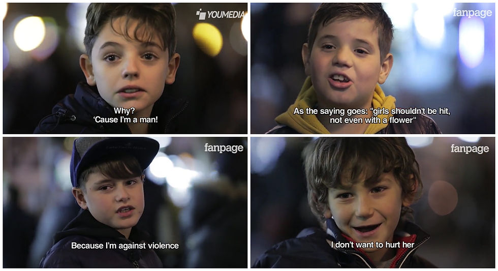
Some of the reasons the boys give when asked why.
But due to the lack of information that the video is trying the imply, it created a controversial issue where people see it as problematic. The use of the girl in the video, in which people state that the boys see her as an object because she was a pretty girl, and the message of domestic violence is more sensitive which shouldn’t have brought children in the experiment as an example. (Robin, 2015) The project of course consists of experimental design where music and camera angle plays an important part and also a little bit of discursive design to let the audience think of the metaphor the video is trying to portray.
"Slap Her" Domestic Violence Ad
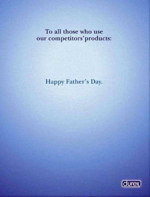
3. Happy Father’s Day by Durex, Lowe.
One of the smartest ways to market your product is to write something smart and witty to get people talking about your product. And Durex has done it. As simple as it is the poster, they put out during Father’s Day has people complimenting the ad’s “roasting” abilities to be hilarious and iconic. A simple blue background that symbolizes the brand and some words that gets their point across, “To all those who use our competitors’ products: Happy Father’s Day.”. Indicates that the competitor’s brand did not have the quality that they have, to prevent fertility.
The ad includes commercial design for it has an audience to entertain and get recognition for their brand. Another thing that intrigues me is the use of words towards to competitor which was literal and how easily sought of.
The ad that took the people by storm.
The ad includes commercial design for it has an audience to entertain and get recognition for their brand. Another thing that intrigues me is the use of words towards to competitor which was literal and how easily sought of.
4. Dream Crazier, Nike.
A one-minute ad that talks about the inequality of female athletes around the world, and how media portray the woman of sports as dramatic, delusional, and something wrong. Narrated by Serena William, the ad talks about how women change the world of sport by the time, and how they succeed to earn their rights as an athlete. To celebrate woman athletes, Nike uses back words often used by men to diminish a woman, Crazy as their campaign title “Dream Crazier”. The phrases in the commercial ignites the voice of women in sport on how mistreated they are, but to succeed is to show the ones who looked down on them how thriving they are. (Nike, n.d.)
Dream Crazier by Nike
The ad includes Responsible design for the awareness on equality for women in the sports field. On the other hand, since it’s a brand they also will be promoting which would include commercial design that would gain a better image for their brand. What really inspires me from the video, is when Serena says, “…if they want to call you crazy, fine, show them what crazy could do.”
5. The Deceased Bar.
The Deceased Bar located in the heart of Kuala Lumpur, Petaling Street has become one of the most raved bars in 2018. The concept of the bar evolves around the olden days' Chinese drugstore interior with displays that symbolizes Chinese black Magic.
"The inspiration behind its deathly drawcard was the building’s original incarnation as a Chinese drugstore, and Chinese /Malaysian superstitious practices at the mystical vicinity of Chinatown KL."
Quoted by Steven Yap, Co-owner of the Deceased Bar (Yap, n.d.).
The drinks are also inspired to look like the layout of a ritual to fit the theme of the bar.
A bar overview by a vlogger.
The atmosphere and design of the bar really hits the theme and made the place look interesting. Having to combined cocktail drinks and naming it after spells of black magic is a creative way to attract the people too. The design includes commercial for it's objective is to attract consumers that are seeking fresh and interesting stuff and for people who are interested in spooky stuff.
6. The Problem We All Live with, Norman Rockwell.
In the year 1960, Ruby Bridges, a six years old African American girl was on her way to her first day of school. But what surrounds her was not other children's but four deputy US Marshal that escorted her to her class. Norman Rockwell was inspired by her and painted Ruby walking in her fresh white dress with the four men side by side her to protect her from the protester that disagree with the civil rights movement. In the painting, the wall behind wrote the word "NIGGER", which is a slur that degrades Black people, and a fresh thrown tomato on the ground. The painting depicts the racial segregation in America at that time, and how people reacted to the change in the system. (Richman-Abdou, 2019)

"The Problem We Live With" by Norman Rockwell.
The painting at first when I saw it, I didn't take any attention, until I read the article about it. It's really inspiring to see a change in humanity where anything can change for the better. I want to include discursive design for how the painting displays the message across for the viewer to understand it's circumstances. And of course, it includes responsible design that brings awareness in racism and hate.
7. Dove Real Beauty Sketches, Dove.
A person can be very humble, but how humble can you be to yourself? To the extend of not seeing how we diminish ourselves? Dove came out with an experiment to let a few women describe themselves to a forensic artist, and they will proceed to sketch them out. After the artist finish sketching, another person will be describing them to the forensic artist to draw them out. The outcome of the two sketches made an impact on the few women for the difference is quite big. This shows that women wants to be something that society portrays as beautiful when they themselves are already beautiful but they only see the flaws that they have. And to make them understand that they are beautiful as they are they would need to see themselves in another person's eye, only then they'll realize they have been only describing their flaws. (Dove Real Sketch Beauty, n.d.)
Dove Real Beauty Sketches | You’re more beautiful than you think.
It's hard to avoid flaws about yourself, but we as women have been portrayed to be perfect in ads or commercials. It's no wonder why we'd be so hard on ourselves. And to help people to understand they mange in use discursive design where they put two different described sketches to let the women understand what is the point of this experiment.
8. Prisoner, Dolk.
Behind the walls of the most humane prison ever, there's a mural of a prisoner throwing a metal ball that's chained to his leg. The artist Dolk wanted to convey to the prisoners that it's ok to have thoughts in escaping or rebelling when being pent up in a place where their freedom is limited. Having a giant mural that displays the inmate's frustration gives them a sense of understanding that people want them to be better. (Halden fengsel, n.d.)

The mural Prisoner in Halden Prison, Norway.
Human rights play a significant role in creating this piece of art, where people come together and set their differences aside to understand why people do things that harm the wellbeing of others.
9. Interchangeable Heels, Mime et Moi.
Wearing heels can be a challenge, and bringing another shoe along to change can be another hassle. Mime et Moi, a shoe manufacturer from Europe invented interchangeable heels. The innovative design wanted to combine comfort and aesthetics to create the ultimate shoe for every occasion. How the shoe works? The heel of the shoe is retractable which makes it removable and replaceable with different height and design heels. And all shoes have been tested for their durability to ensure the longevity of the product for it changes in height often. (Our Story, n.d.)
A breakdown video of the shoe.
The design of the shoe not only saves the storage for brining another shoe, it also saves money when buying shoes. The versatile design of the shoes also creates a timeless style for heels never go out of style.
10. Unknown Pleasure record sleeve, Peter Saville.
Peter Saville was in charge to create a record sleeve for the band Joy Division. When he met up with the band, their manager Rob Gretton passed him a folder which contains an image of a pulsar Cambridge Encyclopedia of Astronomy. The soundwave-liked pattern instantly took the designer's liking just because of how suitable the image fit the album. Then Peter proceeds to invert the color, by making the background of the record sleeve black and the lines on the pulsar wave white. (Grundy,2011)

The use of the pulsar pattern creates an illusion of soundwaves, and to enhance the pattern more is to invert the color of the line and background to show more distinctive lines.
References:
Clubbed: a visual history of UK club culture, (2018, February 22), KICKSTARTER.
Robin, (2015, November 24), Case study: Controversial ‘Slap Her’ experiment tackles domestic violence (and gets 30m views), netimperative.
“Dream Crazier", ( n.d.), Nike
Kelly Richman-Abdou, (2019, March 27), Norman Rockwell’s “The Problem We All Live With,” a Groundbreaking Civil Rights Painting, MY MODERN MET.
Dove Real Beauty Sketches, (n.d.), Dove.
Halden fengsel, (n.d.), KORO
Our Story, (n.d.), Mime et Moi
Gareth Grundy, (2011, May 29), Peter Saville on his album cover artwork, the guardian.


Comments